ABSTRACT
Even though it not always has a positive connotation, to apply the idea of hierarchy to some aspects, may improve considerably the shopping experience, because it minimizes a lot of negative aspects in a shop trip.
__________
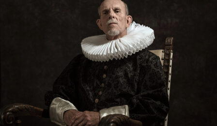
There are few words in the occidental world that rise more suspicion than “hierarchy”. However, from a neurological point of view, we are human beings that not only accept hierarchy, but also, in some way, need it.
Essentially, hierarchy is an organized whole, “something” that is perceived as a non-chaotic structure. In some way, an example of no hierarchy could be a typical teenager bedroom.
The concept is useful for a purchasing process.
To decide your own track
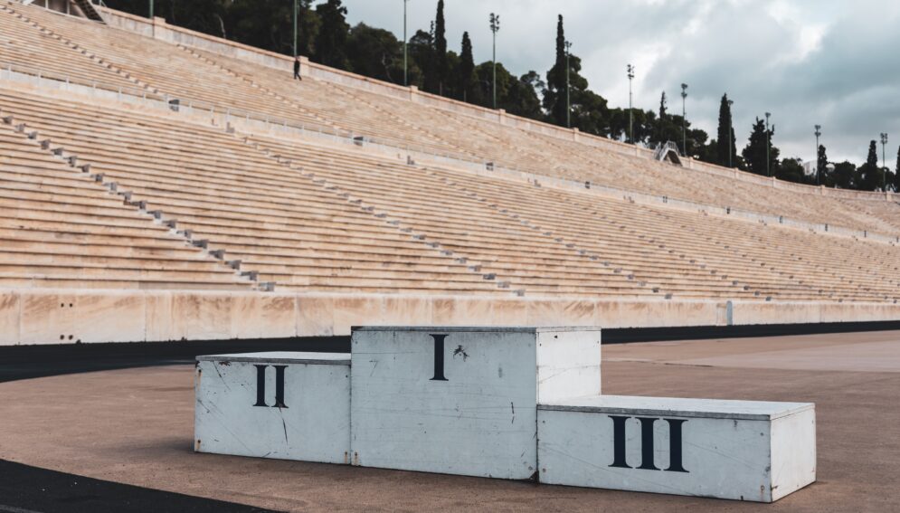
In an interview on an exhibition of Caixaforum (April 20, Barcelona), the prestigious architect Rogers declared that order is essential in every space, and it manifests in what he calls the scale, a group of areas that must be organized one inside another. In other words, hierarchy.
Although he wasn’t talking specifically about retailing, to create a pleasant feeling during the shopping experience, it is essential that the shop (including the parking area) can be understood in a split second after we arrive, the areas are detected and the importance the company gives to some of them is understood. Just like we do in a restaurant: we get visual hold of the space as soon as we get in.
A disorganised shop sells less (a 5% minimum) because it makes it more difficult to perceive the products, it distracts, it tires and reduces the effectiveness of the communication.
The corridors must have hierarchy, so no one will feel disoriented. The “big avenue” must be more relevant than the second level corridors. This way the “navigation” through the shop may be more intuitive.
Signage can be a very good help. Not only colours with a meaning, but also according to topics and area’s hierarchy. However the best signage is the one that is not needed. Something like the best shoes: you don’t think about them when walking, because they are not too tight.
An excess of signage doesn’t communicate better and even overwhelms people. Can you imagine that someone is next to you when you go shopping and doesn’t stop saying “I recommend you this product”? People would say: “Stop nagging me!”
To understand the range of products
Sorting products out in the shop (specifically, the semantic structure of the assortment) aims to turn the range of products into an excellent way of communication, according to consecutive hierarchised criteria.
What kind of organising criteria should be found: the ones the public expects or maybe a new one? If the company wants to improve, logically the hierarchy should be the usual one –well executed-. But if it wants to be innovative, some changes may be introduced, providing that the whole shopping route is an understood and appealing tale; a story where the customer would be the main character.
In museums (a kind of retail) the traditional organising criteria were chronology, schools and pictorial styles, etc. Usually they may be boring because they sort pictures out using those too obvious criteria. The Tate Modern was the first one to organize the artworks by topics. El Prado, in Madrid, achieved great emotions when they decided to face in the same room Las Meninas from Velazquez with the same name artwork from Picasso.
A display of products without any perception of organising hierarchy creates confusion and loses sales.
Cutting down is profitable
There is no doubt that improving the shopping experience is effective. A lot of times it is achieved by introducing positive things, but there is also another way: cutting down the inconveniences and efforts.
Hierarchy not only provides a reduction in doubts, but also achieves the feeling of controlling your own shopping process.
_______________
Lluis Martinez-Ribes