We like stories. As children, we would have been spellbound listening to magical stories, imagining we were part of them.
But narrative is not just oral (a person reading and someone listening); a physical space can also become a story, a 3D story. And the art world understood that. Many museums have clearly opted for immersive exhibitions. ‘The World of Van Gogh’, ‘Gustav Klimt, The immersive experience’, etc.
There, visitors dive into a multi-sensory experience, with a script – a narrative – and, quite often, with a magical touch surrounding the visitor – a dreamlike element – thus generating an immersive experience. That is, they will enter a flow state where their sense of time is distorted.
People can experience reality better when several senses are activated at the same time.
(Eagleman, D.)
When living this type of immersive experience, there is a deep emotional connection between the topic and the visitors. It is far superior to reading a good text, watching a good ad or, even, watching a good film.
However, this 3D-narrative power does not only occur in the art world. We can also find some good examples in business, where space theatricalisation has been created in a very coherent way in order to achieve this immersive experience.
The two following cases, which the m+f=! team was serving the project managers, are good examples.
Caso “tegut… teo”
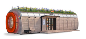
In November 2020, the German supermarket company ‘tegut …’ (Migros group) launched its innovative ‘tegut… teo’ concept. This is a small (50 sqm) supermarket that is totally automated and opens 24 hours a day, every day of the year.
Many people may think that developing a new neighbourhood supermarket concept is getting into a prickly situation, trying to enter a market where achieving differentiation is a real challenge.
However, such challenge was just the motivation Tegut’s great management team needed to carry out a transformation process where, from the start, the focus was on understanding the archetype of their priority customers and finding out what their main ‘life-related pain point’ was.
The ideation process outcome
A completely self-service shopping process where customers can only gain access into the shop if they have previously identified themselves on the app, or by presenting a credit card. There, they have a range of 950 products to buy from, customised according to each store catchment area.
There is no sales staff. With their e-body – smartphones have now become an extension of our bodies – customers can scan products directly and pay for them through the same app. For those who prefer not to use their e-body, there are also some self-checkout terminals available.
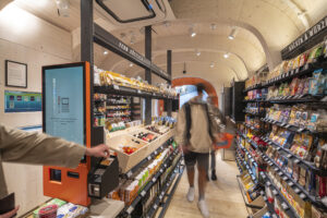
But, what is it that makes it really different?
The verb our brain understands best is ‘to feel’. In this case, customers do not feel it is just another convenience store. That is achieved through theatricalisation, plus the fact that it is deeply anchored in German social values.
At first sight, when coming across ‘tegut… teo’, people can already sense that this is not just another supermarket. Its innovative aesthetic approach stands out from a distance. The company has devised a modular concept that can be constructed in just 24 hours and can be adapted to different environments, both in urban and rural settings.
Its elliptical shape, looking to emulate tegut’s logo, attracts their attention. At both ends of the space, its large ‘eyes’ – that is what they call its round windows – offer a clear view of its interior.
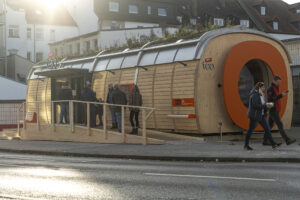
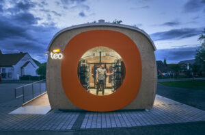
However, behind this unconventional aesthetic approach there is a deeper underlying purpose, the sustainability. From the choice of materials to the construction process and garden roof, the company has opted for one of its signature corporate DNA aspects: having the lowest environmental impact possible.
Another remarkable element linked to the space aesthetics is its ‘social plug-ins’. Outside, the front’s design is conceived in such a way that it enables different spaces-services to encourage neighbour integration: e-bike charging stations, a used-book-exchange shelving unit, or lockers for receiving packages.
Its testing phase is now complete. The 8 shops currently open have been adjusted to suit their respective catchment areas and, now, the company has to escalate the chain throughout Germany.

This was the reviews score for the first ‘tegut… teo’ shop on Google Maps on November 12th, 2021.
Theatricalisation with a purpose
There may be those who think that theatricalisation simply means achieving a good design or an attractive décor. But this is not the case.
What is important is being clear as to what you want to accomplish with such theatricalisation. In the world of business, such purpose should be to improve a specific aspect of customers’ lives.
Let us look at this with another example: an SME in the optical retail sector.
Óptica Martínez case
Óptica Martínez is a small and very successful family business based in Galicia’s city of Pontevedra, in Spain. They are optical stores market leaders in their area. In 2018 they decided to take the next step by closing down the two optical shops they owned at the time and replacing them with a new one, at a different location.
Faced with such challenge, there was one thing they were certain on: their new store should guarantee an innovative shopping experience that would improve customers’ quality of life when shopping for eyewear.
As with the previous case, this project started understanding deeply the archetype of their priority customers. Particularly, their main ‘life-related pain point’ associated with the actual product category (‘optical stores’). Then, obviously, a solution to that life-related pain would have to be ideated.
An evocation research showed that when people think of optical stores, the provoked feelings are very functional, not at all sensory and without any positive symbolism. Many people said that they visit one only when they can no longer see properly.
The project team knew what they must achieve:
At the new Óptica Martínez, customers should not feel like patients with a vision problem that needed to be resolved. Instead, they should experience a deep feeling of wellbeing.
If customers do not feel they are at the optician’s, they will not feel like patients
The project team decided that, instead of an optical shop, the new place should look like a family home. Specifically, the Martínez opticians’ family home. And, being located in Pontevedra, this ‘home’ should reflect that characteristic slow lifestyle that is so inherent to this city – you should visit it, if you have not already done so.
As a result, when approaching its exterior, visitors can already feel like they are about to enter a family home.
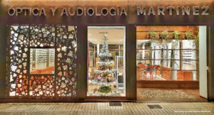
In fact, the shop front does not contain any shop window.
Once inside, customers can move around the different ‘rooms in the house’. And each one is like a different chapter in a novel.
There is a ‘reception hall’ where a member of the family pleasantly greets them and invites them to go in.
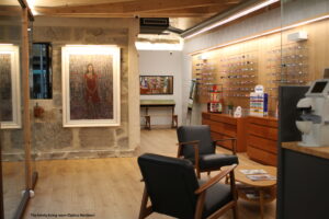
Then, there is the ‘living room’, with comfortable armchairs where they can relax and chat about what they need or are interested in.
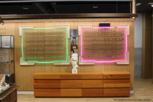
There is also a ‘library’ where pairs of glasses are displayed inside frames, each of them with its different style, as if they were pictures. There, visitors can also find a few books and other elements suited to the room.
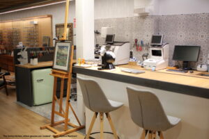
The ‘kitchen’ is a place where, apart from having their glasses fitted, the guests can sit down and have something to eat or drink while chatting with the person that adjusts their frames, as it contains a fridge and a bar with a few stools.
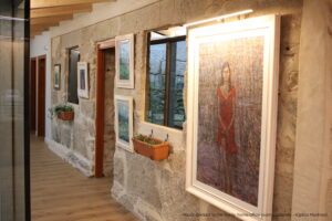
The corridor leading to the ‘home offices’, where professionals check their customers’ vision, has little to do with a traditional optician’s. The works of art on the wall – created by local artists – and the potted plants make visitors feel at home.
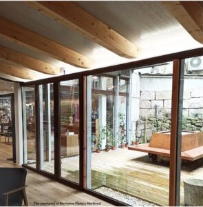
A charming internal patio, where the little ones play safely while adults are being attended to, completes the house.
Within this play script, the most cutting-edge optical technological machinery is included in order to offer the most reliable optical service and care possible. But always avoiding that medical mood that many people find frightening.
People in Pontevedra gave the new shop a really extraordinary reception. Even during the Covid-19 pandemic, their sales increased by an average of 30% compared to the same period of the previous year.
Pleasantly surprised, the most common spontaneous comment made by its visitors is that the place is so welcoming that it does not look like an optician’s.

This was Óptica Martínez’s score on Google Maps on November 12th, 2021.
A 3D multi-sensory narrative is also suitable for factories
A 3D story telling is not just for retail. A tour visit to a factory can be a memorable immersive experience.
Below are two examples of Fagor’s washing-machine factory, a project that its visionary management team commissioned to us at the end of 80s.
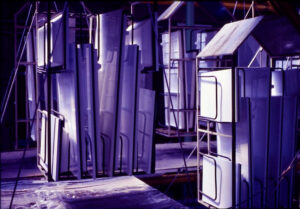
These parts could also move without any theatrical light, but visitors’ feelings would then be very different.
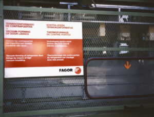
Theatricalisation does not substitute the guides’ oral comments, nor any written information.
A semantic and semiotic code was created to be easily understandable by any visitor, not only by engineers.
Seven takeaways from these cases
- As senses are the fastest way to emotions, the ability to persuade and build a brand is greater when properly using 3D physical spaces than with a 2D screen.
- The digital is not opposed to the physical. Digital or logistic technologies placed within a 3D story telling should be so integrated in the plot that customers will not see them as protagonists, or they may not even perceive them.
- If a shop looks like a shop, or if a factory looks like a factory, do not expect the visiting experience to be immersive. Do not either expect it to help you build a brand.
- Deciding the layout of a physical space is equivalent to creating the script for a 3D multi-sensory film, with different scenes, each of them generating a desired feeling.
- If customers are already OnOff, retail concepts should also be OnOff. For example, at ‘tegut… teo’, the e-body is a must. But this is not a commercial constraint, as almost everyone has one.
- Theatricalisation does not replace functionality. Customers should be able to shop with the greatest level of convenience and minimal frictions. Research has demonstrated that customer loyalty is achieved more by minimising their frictions than by fascinating them.
- All of the above would not make total sense if the story telling did not fit a purpose. And the purpose that works best in business is the one that defines the gratification that customers will achieve with a given brand.
To sum it all up:
In a world where the digital is gaining a presence in people’s usage, shopping or consumption habits, paradoxically, that is when learning how to use the huge expressive and persuasive power of three-dimensional spaces becomes most rewarding.

